
Elevating Di +Pro
2025 - present
DAGENS INDUSTRI
I led the redesign, repositioning, and feature development of Di +Pro with the goal of transforming it from a perceived add-on into a clearly defined premium offering with distinct value and functionality.
I owned the end-to-end user experience, spanning product strategy, information architecture, interaction design, and UI refinement, with a strong focus on creating a cohesive and scalable design system.
Overview and Responsibility
Role: Senior UX Designer / Design Owner
Team: Product Owner, Scrum Master, 7 Developers, Data Analysts
I own the end-to-end user experience of Di +Pro website — from strategic direction to interaction details. My responsibility spans:
UX vision and product positioning
Design quality and consistency
Interaction and accessibility standards
Cross-functional alignment
Design system foundations
Beyond execution, I act as a strategic partner to product and development, ensuring that user experience decisions support both user needs and business objectives.
Design process
1. Proactive evaluation & opportunity framing
Rather than reacting to feature requests, I initiated a heuristic evaluation of the product to assess:
Visual hierarchy and cognitive load
Navigation logic and findability
Feedback systems and error handling
Consistency across components
This created a structured improvement roadmap grounded in usability principles rather than isolated UI changes.
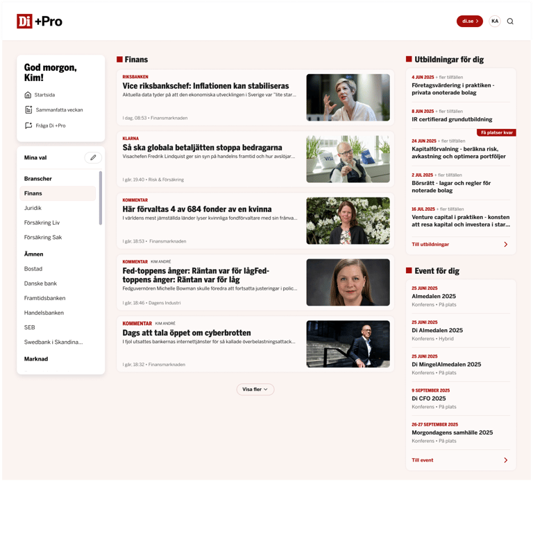
2. Product repositioning through UX
One of the core challenges was that +Pro lacked a distinct identity and felt like an extension of the main Di product.
I led the work to:
Establish clearer visual hierarchy
Refine typography, spacing, and layout rhythm
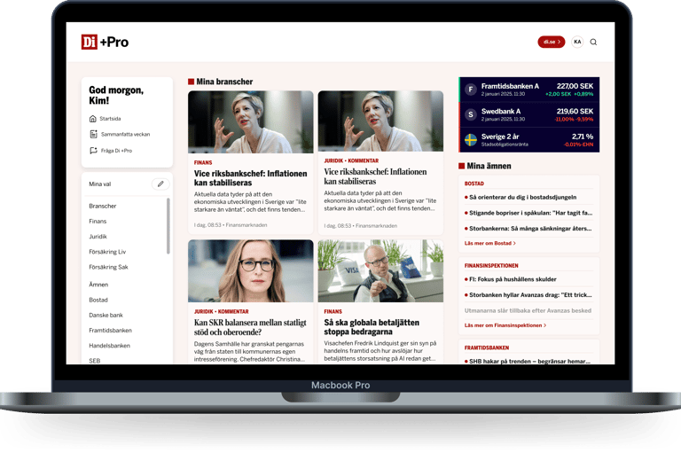
Elevate list pages to feel more premium and content-focused
Introduce structured interaction patterns
The goal was to align perception with value — creating an experience that reflects a high-end professional product.
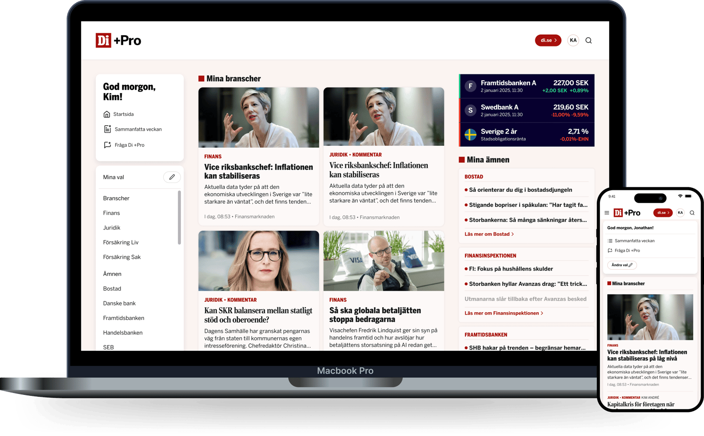
3. Functional value expansion
To strengthen the product’s relevance and engagement, my team drove initiatives to:
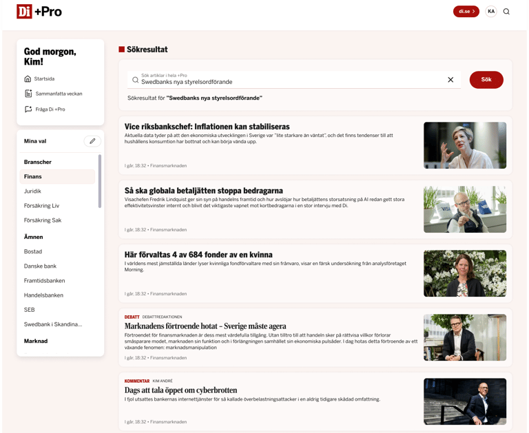
Introduce search functionality
Integrate events and educational content
Clarify microcopy and error states
These initiatives were taken proactively and developed in close collaboration with product stakeholders. Performance impact is continuously tracked by analysts, creating a feedback loop between UX decisions and measurable outcomes.
New features designed to help users be as productive as possible—and to ease their daily work and routines—are continuously being developed and refined.
4. Building foundations for scale
At the same time, I started to build more long-term structure.
I Defined color aliases to be used across app, website, and Figma
Improved consistency in components
Adjusted tab order and interaction logic
Raised accessibility awareness in the team
This work helped reduce inconsistencies and made collaboration with developers smoother. It also supports future scalability.
Expression
The visual direction of +Pro was updated to feel:
More premium
More structured
More calm and focused
Less visually crowded
Special attention was given to list and overview pages, where users spend most of their time.
The goal was to support faster scanning, better clarity, and a stronger sense of quality.
UI design
The UI work focused on:
Clear typographic hierarchy
Consistent components
Improved feedback patterns
Better error messaging
Stronger interaction standards
Even smaller details, like microcopy and tab order, were treated as important quality improvements — not just minor fixes.
Summary
As the UX responsible of Di +Pro, I have:
• Set the overall UX direction
• Initiated and driven major improvements
• Strengthened the premium positioning
• Introduced new functionality
• Started building design system foundations
• Improved collaboration between product, development and analytics
This work moved +Pro from incremental UI updates to a more intentional and structured product experience.

Still curious?
This project was full of unique challenges and insights. I’d love to share more—feel free to get in touch!
All content in this portfolio is for demonstration purposes only and showcases my UX design process and skills. All trademarks and materials remain the property of their respective owners. No ownership is claimed, and the content is not intended for commercial use.
Jonathan Morosini
Crafting intuitive experiences for users and businesses.
© 2026. All rights reserved.