
Redesign of Expressen
2023-2024
EXPRESSEN
Extensive redesign initative with purpose of modernising and improving the userfriendlyness and accessibility of Expressen website.
Overview and Responsibility
The purpose of this project was to introduce a complete redesign of Expressen’s website and application. The previous design had remained largely unchanged since its creation, with only minor adjustments over time. The goal was to create a more modern, engaging, and user-friendly experience for both the website and app.
My role in this project was to serve as the User Experience (UX) Designer and representative on the Expressen site team. I collaborated closely with editorial staff and stakeholders to capture the essence of Expressen’s brand and define how the audience perceived it.
Design process
We began with several weeks of collaboration, involving stakeholders and representatives from the editorial team, to define Expressen’s visual expression.
Next, we held a series of workshops to explore various visual elements, such as shapes, expressions, and design representations for the content on the site. The design team and I worked together to create visual solutions that aligned with our findings and the goals of the project.
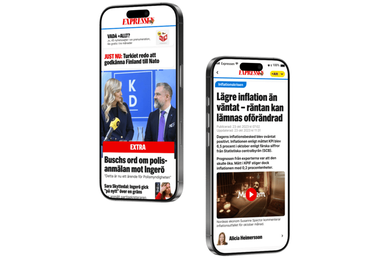
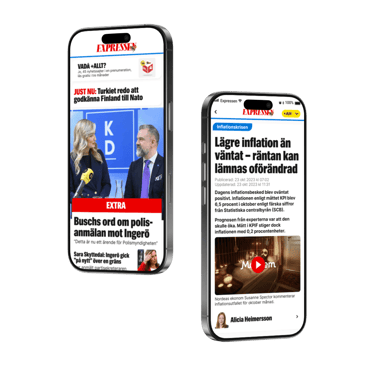
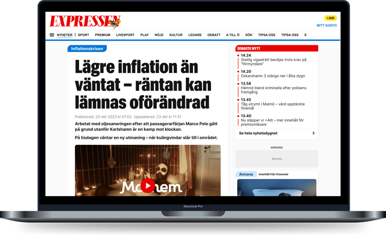
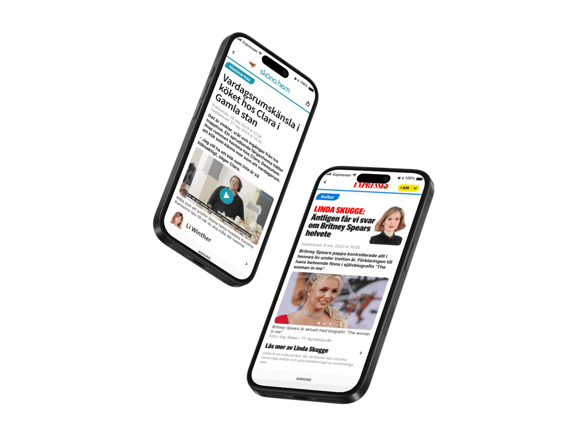
Key areas we focused on included the design of article layouts. These are crucial entry points into articles, consisting of images, titles, and brief preambles. The design varies depending on the type of article, whether it’s a chronicle, editorial piece, or premium content.


Expression
From our research, we identified that Expressen’s previous design was seen as messy, cold, and stiff. To address this, we focused on creating a cleaner, more accessible design while reducing friction for users.
We introduced more vibrant colors by altering the hue of existing brand colors, giving the site a warmer and more welcoming feel. A significant change was the introduction of softer corners in the design, which helped counteract the previous stiffness without making the experience feel childish.
UI design
Later, all the UX designers collaborated on the user interface, each bringing their unique skill sets to the table. This collaboration created valuable synergies, as our specializations complemented one another. These specializations included visual art direction, user research, and interaction design, with expertise in prototyping tools such as Figma.
Summary
After completing the initial design work, we presented the first iteration to the stakeholders, including the editor-in-chief. They shared our vision and gave us approval to proceed.
We then collaborated with product owners and the editorial team to plan the step-by-step execution of the redesign. The new design was rolled out in smaller, manageable phases to ensure a smooth transition and effective implementation across the site and app.
Still curious?
This project was full of unique challenges and insights. I’d love to share more—feel free to get in touch!
All content in this portfolio is for demonstration purposes only and showcases my UX design process and skills. All trademarks and materials remain the property of their respective owners. No ownership is claimed, and the content is not intended for commercial use.
Jonathan Morosini
Crafting intuitive experiences for users and businesses.
© 2026. All rights reserved.